
 This cartoon is unusual for it’s hand-lettering. It’s not mine. It’s an evil twin. Years ago I converted my script into a font, without bothering with kerning and other peculiarities (for example, when I write a word that starts with an uppercase T, I always start the next letter beneath the T’s awning, not off to the side like a neighbor’s house.)
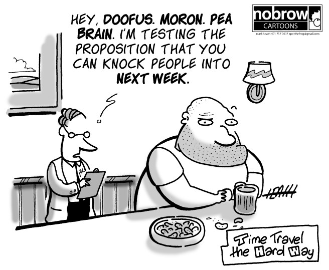
(In the above cartoon, I’m referring to the scientist’s speech. The sub caption, with the letters elbow-to-elbow like passengers in a crowded elevator, is hand-lettered.)
I did this because the software was gratis and very basic; it didn’t allow for refinement. If it had, I imagined many days of coaxing, nudging, tweaking, formally recreating the informal. My mind is easily diverted and anything that requires days of work is likely to derail.
But if I ever write another strip, I’ll give it another go, attempt a better font — I do a lot of re-writing, and the lure of typing a tweak, rather than drawing it by hand (when I letter a caption, it feels like I’m drawing), is hard to resist.
